
Buy now. Register. Learn more. Sign Up. Download.
None of these regular call-to-actions (CTAs) will give you your desired result because your target audience is more intelligent, smarter, and more experienced than ever before.
As a marketer, I bet you already know that visitors who don’t click, won’t convert.
Your website visitors cannot pass through the checkout process or registration form without hitting at least one button. And that single button can be improved upon just like all of your other buttons.
If you want to boost the conversion of your calls-to-action, the first thing is to stop neglecting the so-called “small things”. Most times, the conversions you’re looking for will completely depend upon something very small.
For instance, having a weak call-to-action with no sense of urgency is one of the primary reasons why most sales pages and landing pages fail to convert leads into customers.
You must understand, however, that not all CTA messages are built equally. Lots of B2B marketers are not using effective calls-to-action to engage their target customers. And worse, some are not using them at all.
A study from Small Biz Trends found that about 70% of small business B2B websites have no calls-to-action:

Now, stop making baseless excuses for your lack of an efficient CTA. Instead, implement some of the following click-boosting strategies in this post, which have already proven to boost conversions between 20% to 95%.
1. Create A Benefit-Oriented CTA
Your CTA has to really provide some sort of benefit to the user to make him/her click.
Just imagine the last time you bought something on the internet… what prompted you to take action? I’m sure you took action not because you were looking for what to buy, but because you saw a good benefit attached to the ‘Buy’ button.
In the same vein, a user cannot take action if your CTA is not convincing enough – they want to know exactly what they’re getting, and what they’ll achieve with it to avoid wasting money.
Therefore, your call to action has to provide a solid benefit to your customers. If people are not so sure about the value they’ll get from your CTA button, they won’t click. It’s as simple as that.
The two marketers I can mention here that are doing well with a benefit-oriented CTA are Bryan Harris and Noah Kagan. At the VideoFruit blog, Bryan promises to show his users how to get their first 100 email subscribers. Then, on the call-to-action button, he asks them to “START YOUR EMAIL LIST”:

Noah Kagan from OkDork did something similar:

Furthermore, apart from the text in your CTA button, the button color and placement are equally as important as the message.
For example, lots of marketers have discovered that placing a subscription box on the bottom of the landing page performs best, while other people saw an increase in conversions when they placed the button on the left side of the page.

It’s your duty to find out which placement works best for you. You don’t have to do what others are doing, just test, test, and test some more before choosing a winner.
Also, figure out which button color works well for you. Green buttons may imply money and prosperity, but the best choice is to always test.
Test every element of your CTA (including button color).
2. Make CTA Buttons Appear Like Buttons
The subject of “signifiers” is critical when it comes to conversions and user-experience (UX).
When we mention “signifiers” in the web design space, we’re mostly talking about making every element on a web page to look exactly like what it’s supposed to be used for.
It means that a button should look like a button… and nothing else.
This will make it easy for users to immediately identify it as an element that they should click on to initiate an action.
So let me ask you… when a first-time visitor lands on your landing page, will he/she absolutely identify which elements are clickable? Or will he/she get confused and start guessing what to do? If you agreed with the second question, then you have to change something immediately.
In a nutshell, buttons are generally easier to click when we’re sure they’re clickable.
It’s no wonder why gray buttons often convert poorly — they look deactivated, so lots of visitors won’t even know they’re expected to click them.
For example, when you visit Create Debate’s homepage, you’ll see a brief introduction about what the site is about which also contains a “Join Now” link alongside an FAQ link.

However, the problem is that they’ll be missing on some leads here because many of their visitors won’t know that they’re meant to click those links. But if they can make the “Join Now” stand out and look like a button, it’ll be able to trigger their desired action when a user sees it.
Can your visitors easily identify the CTA on your site and landing pages? Is the call-to-action visible enough? Does it have signs implying clickability?
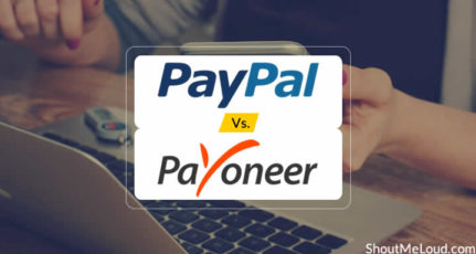
Finally, another good idea to make your call-to-action stand out is to have lots of space around it, like that of PayPal:

When a user sees this level of openness, they know exactly what they’re supposed to do.
3. Provoke Curiosity
Use curiosity effectively, and you’ll see a massive boost in conversions.

According to Andrew Sobel, one of the 6 rules for evoking curiosity is:
“Tell people what you do and the results you get, not every detail about how you do it. The former is interesting; the latter can become tedious.”
Curiosity brings out the burning desire to know something you didn’t know before. If you design your call-to-action message in a way that could create a burning desire for your prospects to find out what’s on the other side of the CTA, they’ll be more willing and eager to click, thereby giving you the lead generations you want.
And, remember:
- The higher your click-through rate, the more sales you’ll generate.
Similarly, a recent study from the University of California-Davis stated that:
“When our curiosity is piqued, changes in the brain ready us to learn not only about the subject at hand, but incidental information, too.” (Mentioned on the Scientific American blog.)
In other words, emotional triggers like surprise, trust, fun, delight, and, most importantly, satisfaction arouse curiosity in your users:

For example, when people trust you, they’ll be more willing to click. In the same way, when people are delighted with your PPC ads or landing page copy, they’ll immediately click, because they envision a benefit.
Curiosity will make you want to grab an offer because you can perceive the reward and how it can benefit your own life. It’s an emotional hunt to know more, learn more, be more, and have more.
You should always remember that your target audiences are human beings who continually make emotional and rational choices depending on the information presented before them.

However, one important thing when arousing curiosity is to be very honest with your customers. Don’t deceive them with action buttons and power words only to give them something contrary to what you promised. When you promise to give customers free training videos, do just that. Always stand to your promise and watch your conversion rate go higher.
4. Offer A Freebie
We all love free stuff, especially when it’s useful free stuff.
Although, there may be no such thing as a free lunch, even in free town, but as humans, we can’t resist the attraction of a bonus, including a free eBook that sounds interesting.
Offering your customers a helpful freebie is one super-effective way to attracting and retaining more of them. Therefore, you have to start offering a bonus in your CTA message, too.
For example, when a company offers you a great opportunity to save a little money while making a purchase, that’s a reward because they’ll bear all the risk and you’ll gain more.
The cell service company, Sprint leveraged this strategy to grow its customer base. Currently, Sprint provides savings of $200 or more on the Samsung Galaxy S6 Edge+ smartphone.

Similarly, Verizon also uses this tactic, giving customers the opportunity to save $300 when they trade in an old phone for a new one.

In fact, the majority of telecommunications service providers out there offer some kind of “bonus”, such as free shipping, extra savings, rebates, and “buy-one-get-one-free” offers.
Make Your CTAs More Attractive
Your sales copy and PPC ad campaigns, promotional banners, and landing pages can only drive quality leads and customers to your business when they click on your call-to-action button.
To a significant extent, a high click-through rate (CTR) equals a higher conversion rate.
If all the other important elements like your sales funnel and offer are properly optimized for your target users, and you’re not seeing conversions, the problem is likely with your CTA.
Pay attention to it, and make it convert!
What other tips do you have for making an attractive call-to-action? Share your thoughts in the comments below!
Here are a few more conversion posts to check out:
- 5 Must Use Tools To Increase Your Website Conversion Rate
- 7 Tips To Increase Conversions By Modifying 404 Error Page
- 9 Social Media and Email Marketing Power-Ups for Better Conversions
Like this post? Share it with your friends!


Really Great and best for me. I usually required 3/5 hours to write a single article.
Hi Harsh,
Thanks for Sharing these tips with us. CTA is most important part for conversions, I will definitely apply these tips on my blog.
Nice information on topic -call action, this action will help to customer click more and go to target page. Thanks for nice topic.
It will help many peoples to create better call to action. I will apply these methods on my website.
Thanks, Harsh.
Hi Harsh,
All solid tips here buddy.
Getting super clear and focusing on creating calls dripping with benefits is a simple way to boost those clicks. I put myself in my reader’s shoes before writing any call to action. What do they need help with? How are they struggling? What keeps them up at night? In terms of their problems, but also, in terms of their dreams?
If you sum up the strongest benefits of following a specific call to action you will have few issues getting those clicks because folks are after benefits, first and foremost. They want to know how taking the call will help them, so make it super clear.
I have also found that going more in-depth than a line or 2 does well for me. I am clear on it. Sometimes when I feel like I’m rushing through making a call I feel unclear and do not drill down on the benefits. Different deal though when I get serious about going in-depth and devoting at least a paragraph or 2 at the end of my blog posts.
Thanks for sharing Harsh.
Ryan
I too agree with you. The competition is inculcated to such an extend where doing anything with ease is almost impossible. Specially when it comes to CAT, things are much worst.
Thanks to you for providing such nice tips. I will surely try these thing before I go for anything else.
Hey Harsh!
I like your tips on CTAs man!
This information is so important to learn as a marketer online. You have to be consistently learning, tracking, analyzing, and tweaking to find out what works best for your type audience in your niche.
You are right, not every tip will work for everyone, that is why you need to do your own research with your niche audience. Of couse, we do have to follow the basics, and we do need to test everything out including what others are doing.
What I like to use a lot, to make people take action, is Curiosity. I like to be a bit mysterious WITH a benefit – so the visitor will really think about clicking or signing up. You know what I mean! 😉
Thank you for sharing your tips here!
Cheeers! 😀 😀
Thanks for this post. This is reply to my tweet question. But again my problem is that my site is just new with very few posts. I do not know what freebie can I provide and what kind of cta I can create. Thinking to create small ebook of posts in pdf format and try that. Thanks a lot for your post. I learned many things from shoutmeloud and wpbeginner.